Communication
at the
intersection of:
intersection of:
O1 experiment
Welcome to my portfolio
and function 04
02 eclecticism
03 form
Me & MY approach
My name is Arina Khmelnytska, and I am a multidisciplinary graphic designer from Kyiv, Ukraine. My approach combines various styles and techniques while placing a strong emphasis on form and function. My ultimate goal is to craft visual communication that effectively delivers a specific message.
This website serves as a reflection of my design philosophy, showcasing a curated selection of works that exemplify my approach and thinking. I hope this portfolio will provide you with an immersive journey into my design process.
This website serves as a reflection of my design philosophy, showcasing a curated selection of works that exemplify my approach and thinking. I hope this portfolio will provide you with an immersive journey into my design process.
For a full experience please visit a desktop version
Selected works:
[Brand Identity]
01
[Posters collection]
02
[Book Layout]
03
Brand identity
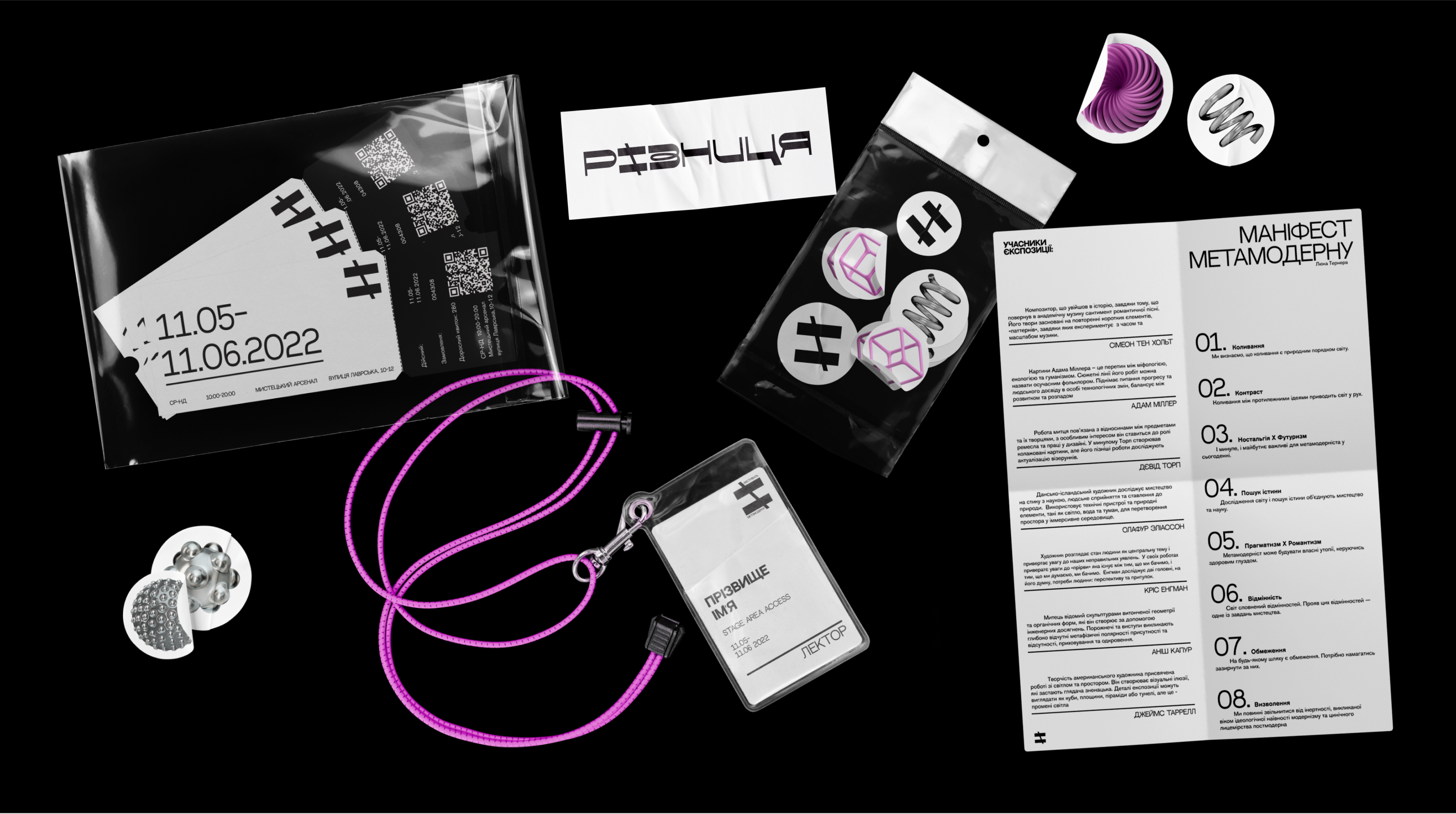
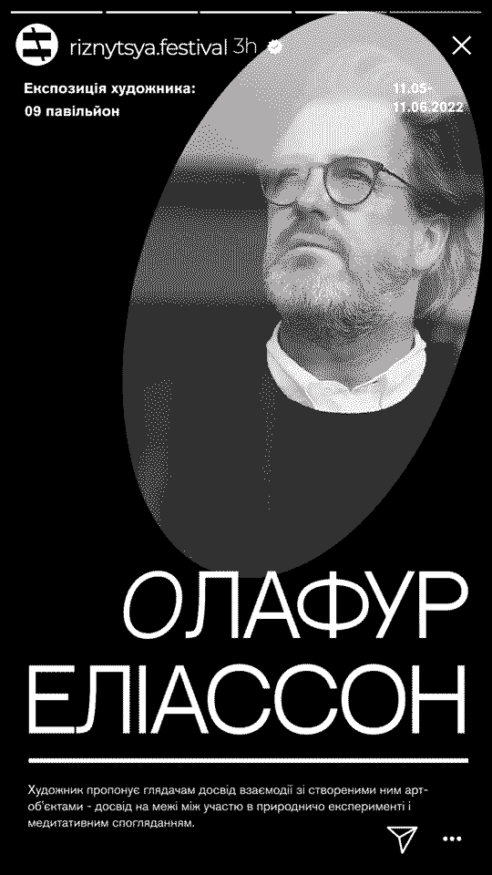
riznytsya festival
riznytsya festival
Content:
[brand identity]
[storytelling]
[motion design]
[3D]
About:
The festival aims to celebrate the metamodern art style, fostering a dynamic discourse between artists and audiences while uniting polar representatives of the art world under the umbrella of metamodernism. Drawing inspiration from the dual meanings of "riznytsya" in Ukrainian - the difference and the remainder of subtraction - the festival's visual identity centers on a dash symbolizing the concept of the remainder. This symbolic dash is prominently featured in all festival materials, signifying the interplay of modernism and postmodernism, encompassing a dynamic struggle of contradictions while maintaining a delicate balance between these two opposing directions.
The poster design further reinforces the festival's theme with a captivating spinning spiral, representing the continuous flow of historical events and art's integral role within this cyclical progression. The spiral's motion signifies how history unfolds, both revisiting familiar territories and ascending to new heights, much like the metamodern approach emerges from the interplay between modernism and postmodernism.
Through this immersive experience, participants will gain a deeper appreciation for the nuances of metamodernism and its profound impact on the ever-evolving world of art.


-4.gif)
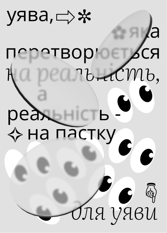
Posters Collection
About:
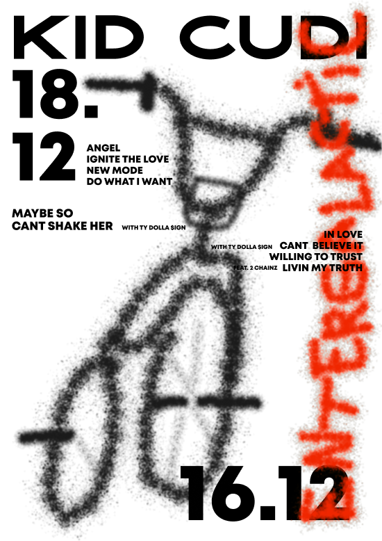
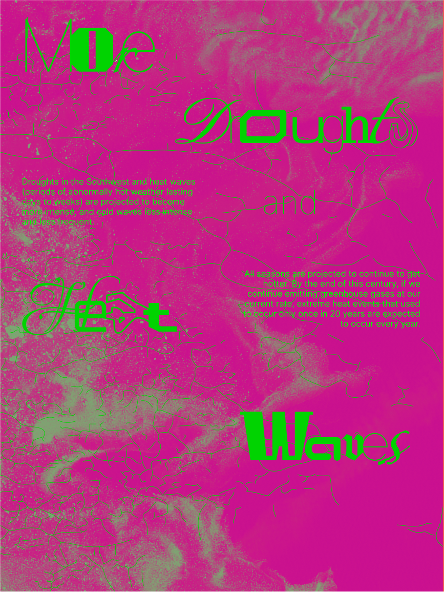
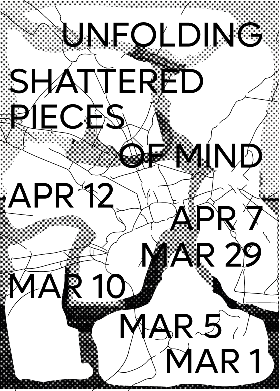
This captivating design collection showcases the personal practice, focusing on the exploration and experimentation of poster design. A poster has always been an ideal platform for unleashing creativity and testing novel techniques and approaches. Embracing the essence of experimentation, this collection comprises a diverse array of poster designs, each crafted in distinct styles, such as 3D imagery, mixed media, and the fusion of analogue and digital elements. By pushing the boundaries of design through innovation and trial, this project emphasizes the indispensable role of experimentation in fostering artistic progress and inspiring fresh perspectives in the realm of poster design.
This practice places a deliberate emphasis on evoking a specific mood and atmosphere for the viewer, rather than prioritizing strict readability. Recognizing that visual language is as potent and expressive as any verbal communication, this collection is dedicated to harnessing the unspoken power of design.
This practice places a deliberate emphasis on evoking a specific mood and atmosphere for the viewer, rather than prioritizing strict readability. Recognizing that visual language is as potent and expressive as any verbal communication, this collection is dedicated to harnessing the unspoken power of design.


"THe type primer"
book layout
book layout
Content:
[book layout]
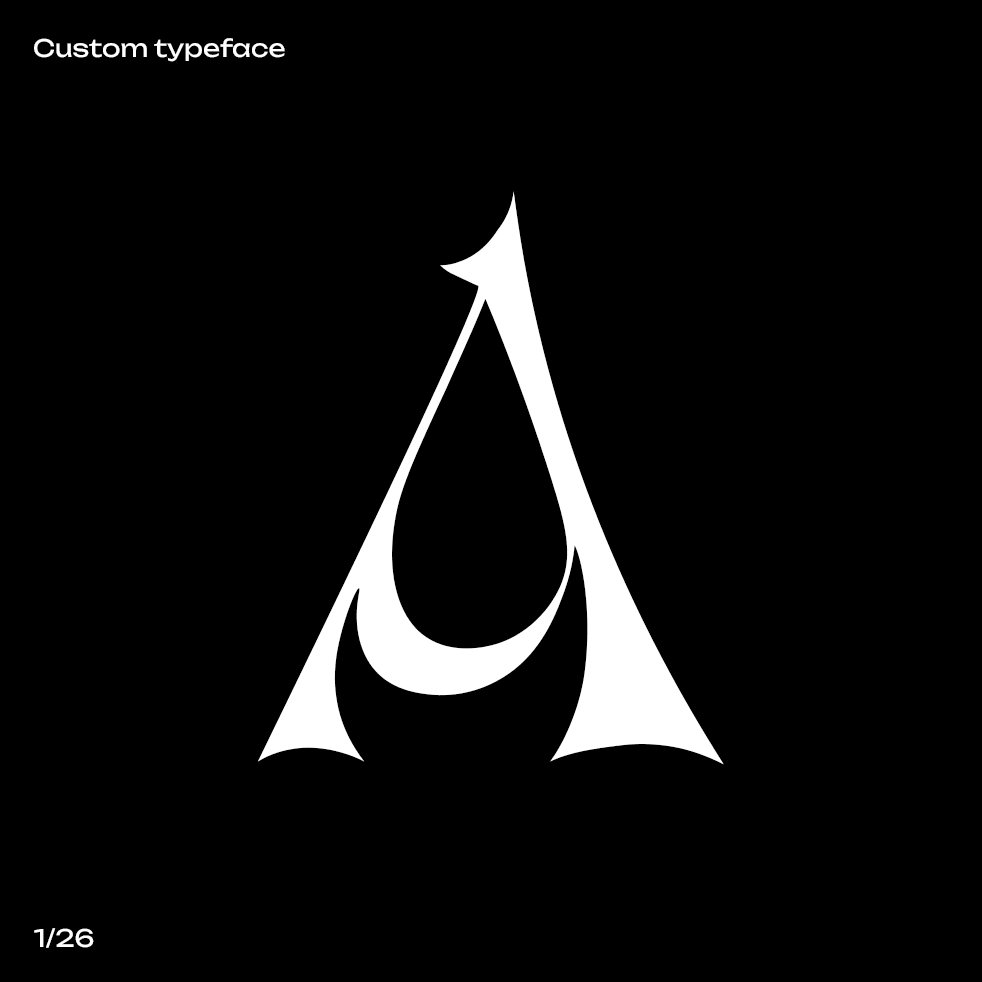
[custom typeface]
About:
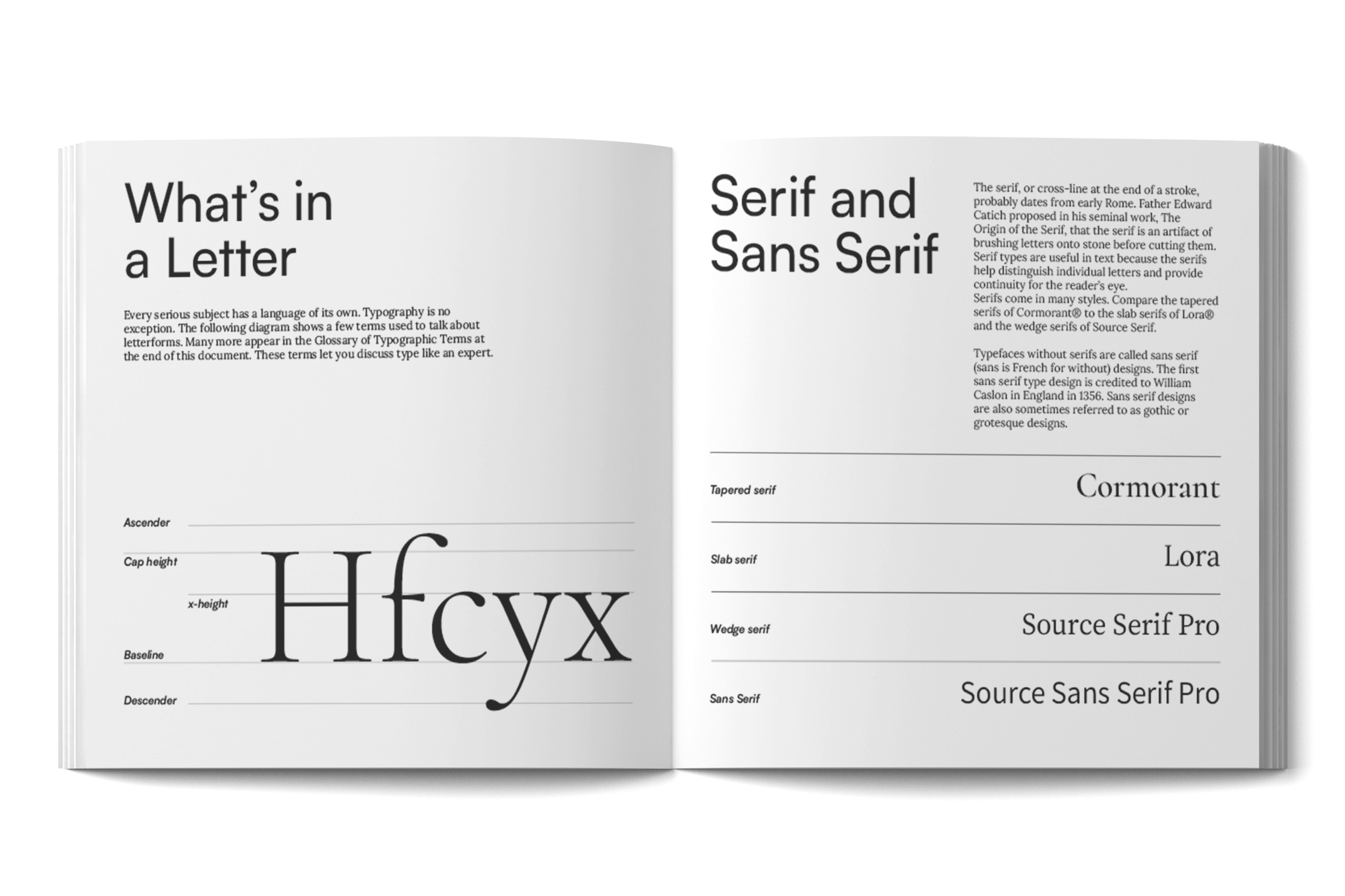
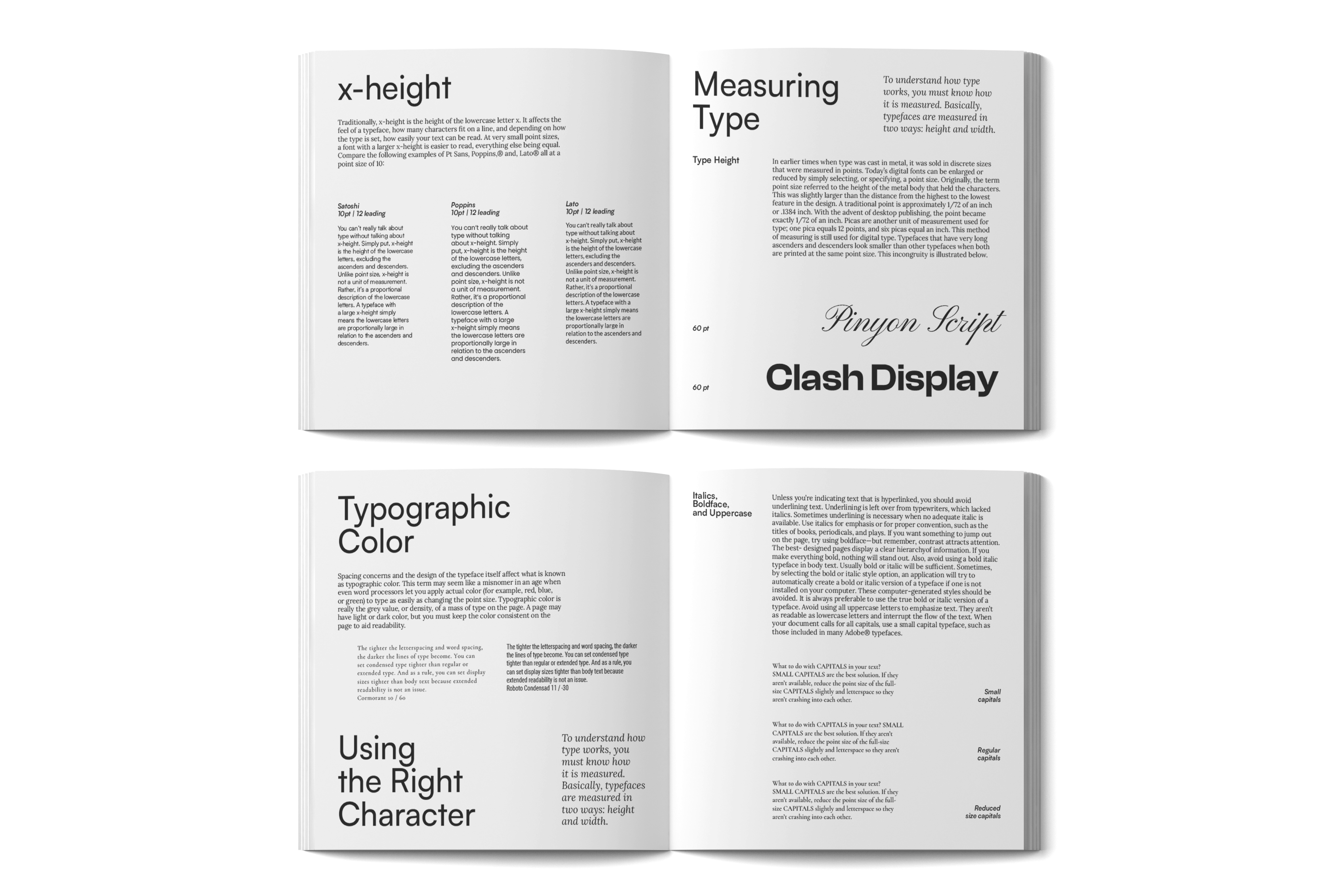
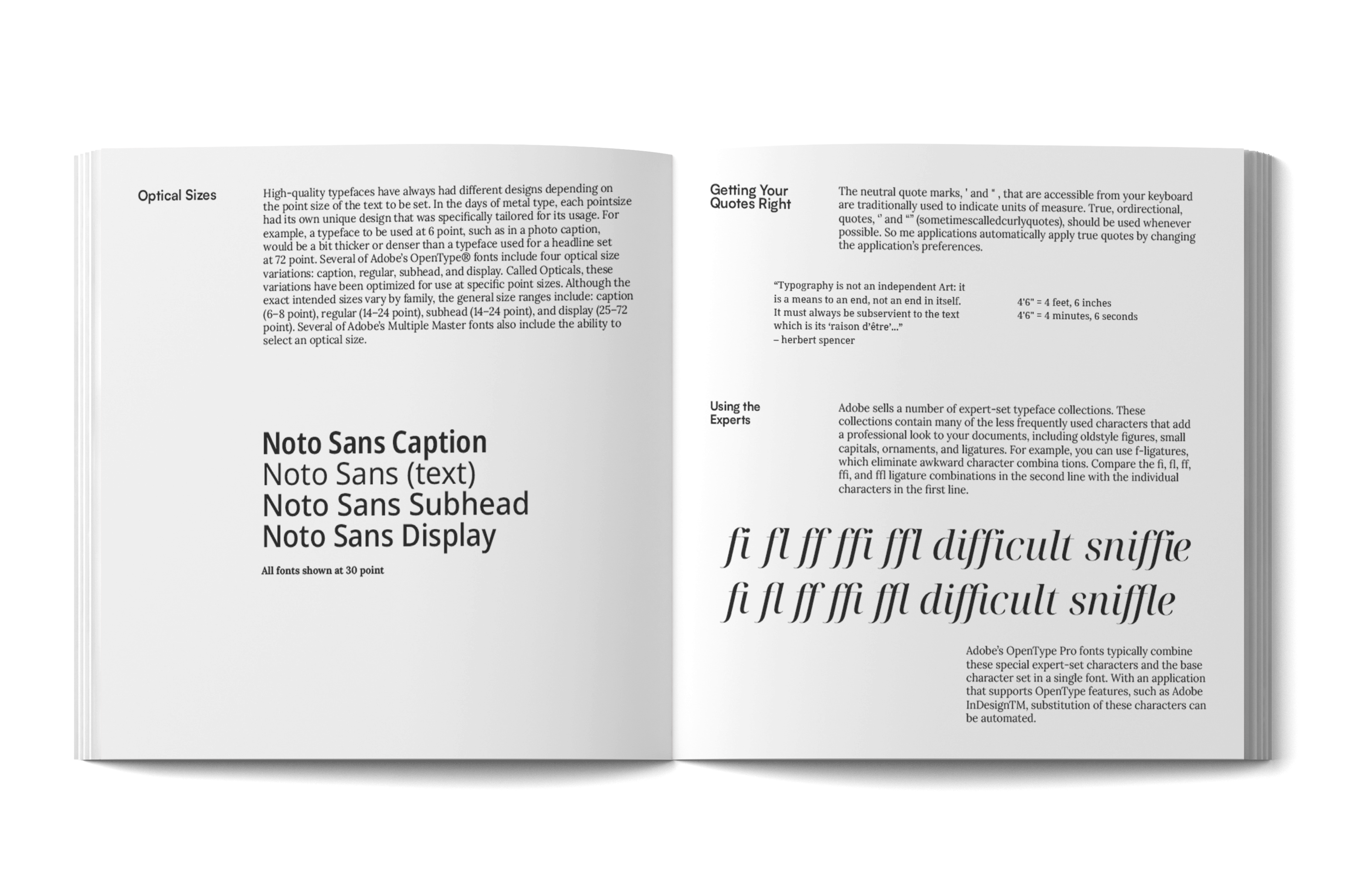
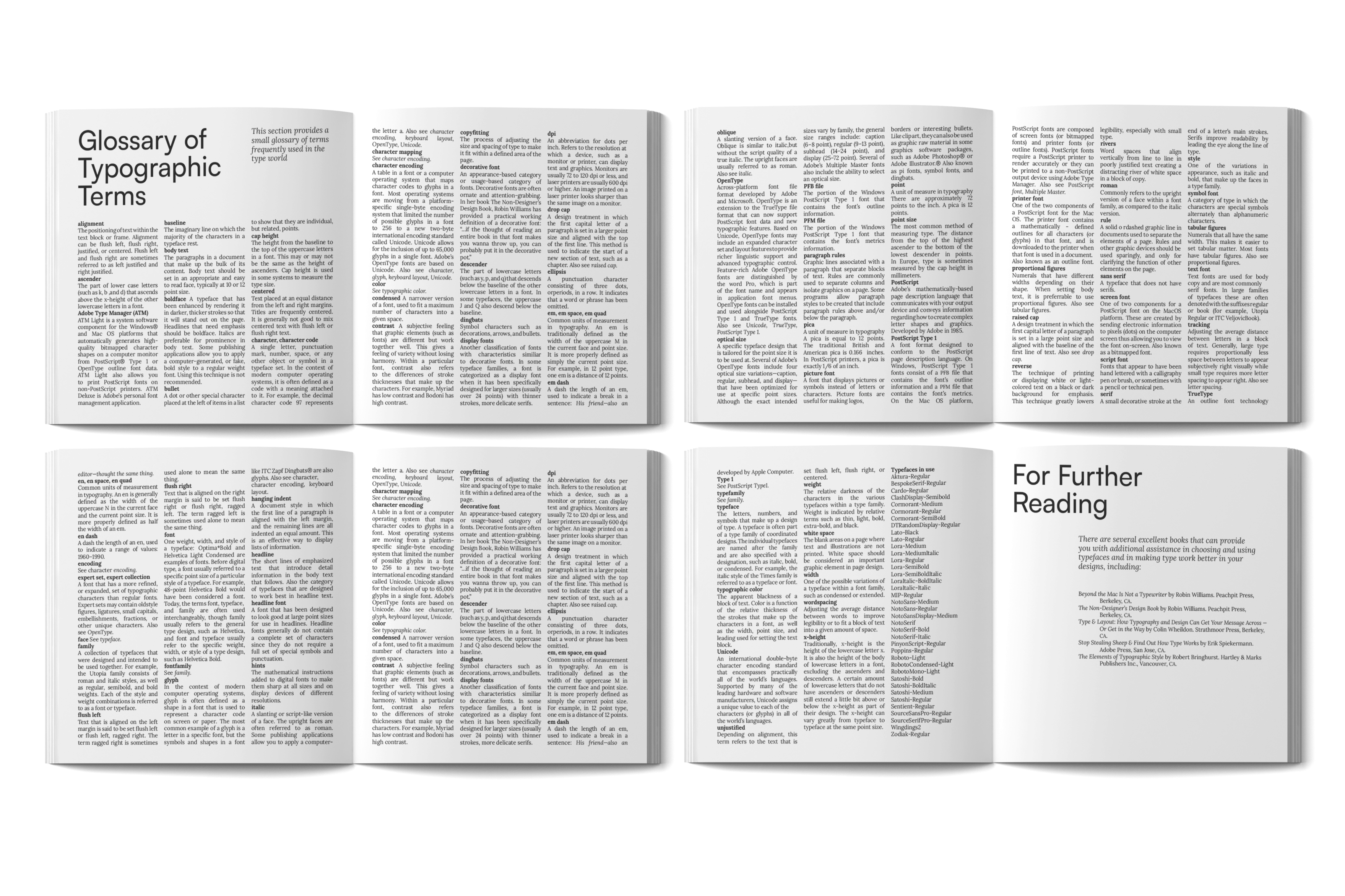
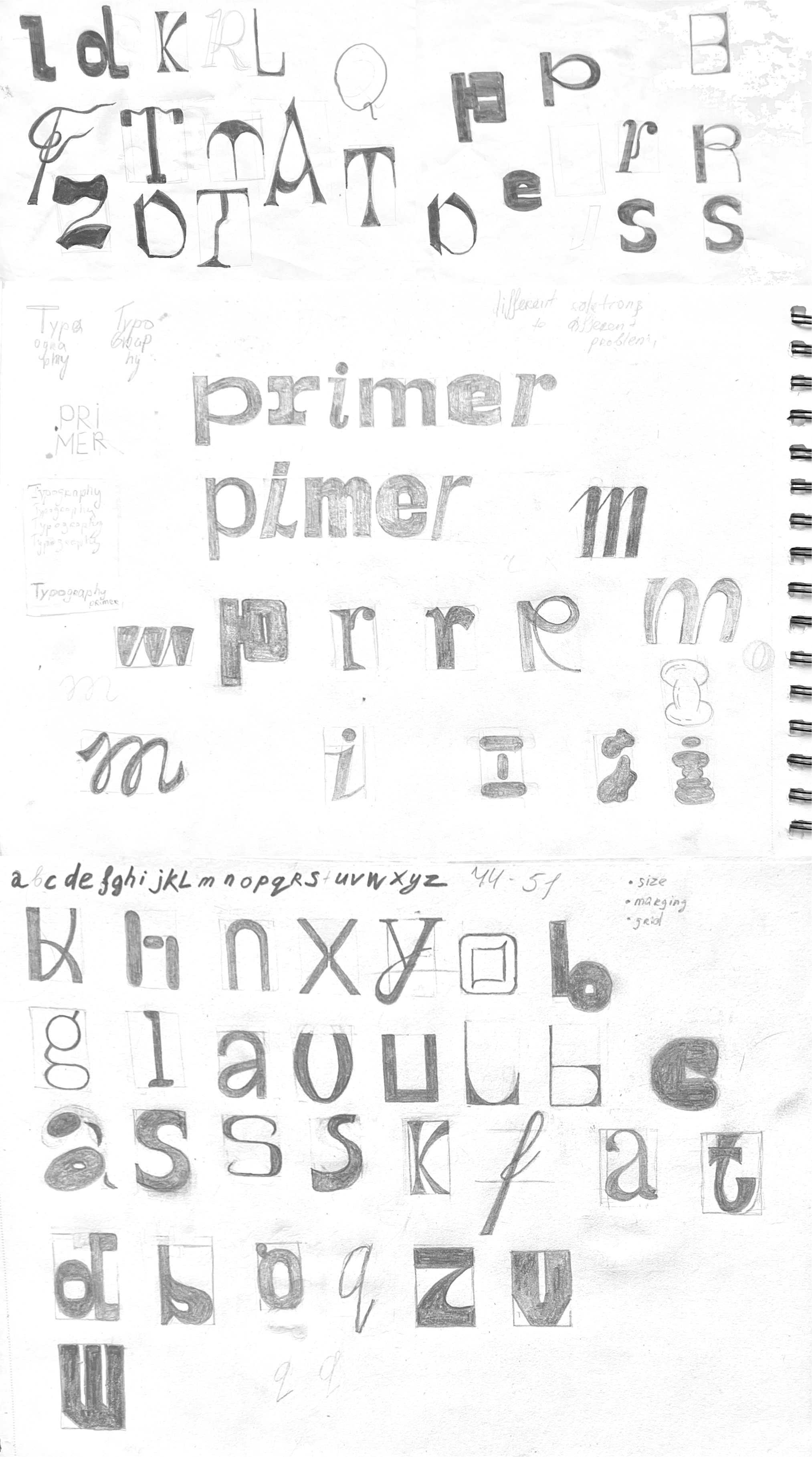
The primary focus of this design project is to create an engaging and immersive book that introduces beginners to the basic rules of typography design. Targeted at young creatives and aspiring designers who are just starting their journey into typography, the book aims to transform an initially mundane subject into a fun and exciting experience.
To captivate the target audience and make the book stand out, the design approach centers around the use of expressive typography and experimental layout. As a key component of the project, a custom typeface was created, featuring a diverse range of letters that vividly demonstrate the power of typography. Each letter in the typeface embodies unique characteristics, illustrating the vast creative possibilities typography offers. This custom typeface enhances the book's experience, inspiring aspiring designers to experiment and harness the full potential of typography in their own projects.
The main objective is to ensure that the book feels like a delightful playground for the readers, where they not only learn the fundamental rules but also actively engage with them through exaggerated and playful examples. Each chapter will take the readers on a unique adventure, showcasing typography principles in unconventional and exaggerated ways.